Carlsberg is a high profile beer brewing company from Denmark, which today has a global network of enterprises. The company is renowned for its pioneering of effective brewing methods.
Meaning and history

The first Carlsberg logo featured an elephant and a swastika. For political reasons, the logo was abolished in the 1930s. The company’s current logo goes back to 1904. It was hand-drawn by Thorvald Bindesbol, an industrial designer from Denmark. The logo features the Company name, and the font pretty much retains the designer’s handwriting. It is topped by a red-and-gold crown, which symbolizes the company’s ties with the Royal Danish Court.
The Carlsberg logo represents four colors: green, white, gold and red. As the logo appears on different products, the green and white sometimes exchange places: the company may come in white on green background, or vice versa. The colors of the crown remain unchanged. The palette expresses energy, excellence, freshness, passion, determination, elegance, royalty, and grace. In 2004 – a century since its introduction – the Danish Design Center endowed the logo with a design prize. That was an unprecedented event in the history of logo design.
What is Carlsberg?
Carlsberg is the name of a globally-known beer brand, which was established in Denmark in 1847. There are several types of drinks, produced under the Carlsberg label, from water to classic beers. Today it has grown into a huge group, owning several popular brands of beer, exported all over the globe.
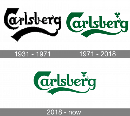
1931 – 1971

The Carlsberg logo, designed for the beer manufacturer atthe beginning of the 1930s, has already featured that recognizable design, we all can see today. Although the logotype was written in black lines, it was executed in a custom cursive font with bold lines and elongated tails of some letters, and a bold wavy underline of the inscription, which was merged into the tail of the “G”.
1971 – 2018

The Carlsberg logo, which became official in 1931, was designed by Thorvald Bindesbol in 1904 but was just laying on the table for more than two decades. It was a dark green stylized script lettering with a delicate emblem in the same color, placed above the letter “R”. The inscription was handwritten and had the tails of the “C”, “R” and “G” elongated and playfully curved.
The emblem depicted a three-leaf with rounded details and triangular shape, which is placed pointing down and resembling a fine snowflake when the logo was drawn in a reverse color palette — white on green.
2018 – Today

The redesign of 2018 made the Carlsberg logo fresher and more elegant by elevating its color palette to white and a lighter shade of green, which Joe evokes a sense of success and growth. The typeface of the nameplate was refined and softened, making the lines of the inscription thinner and more rounded. The upper bar of the letter “R” was smooth and bold, resembling a leaf of a tree, which balances the Carlsberg emblem, placed right above it.
Font and color
The stylized extra-bold lettering from the primary Carlsberg badge is set in a unique designer typeface, with almost all letters stylized. The title case inscription uses a very smooth yet edgy type, which looks a bit similar to such fonts as Aligarch Semi Bold and Gestura Semi Bold, but with all the contours modified and lines strengthened.
As for the color palette of the Carlsberg visual identity, it is set in an intense shade of green, looking close to forest-green, and evoking a sense of excellence and growth. Green has always been associated with wealth and revival, but here it is also a color of the glass, used for the Carlsberg beer bottles, and it works really well in a combination with white, making up a very refreshing image.


