

![]() Burberry Logo PNG
Burberry Logo PNG
Burberry is a high-end fashion house, which was established in 1856 in England. Today it is one of the most famous labels in the world, with its instantly recognizable iconic trench coats and checkered patterns. The brand has its boutique worldwide and sells its luxury fashion items through almost 500 boutiques across the globe.
Meaning and history
![]()
For more than a century, the visual identity of the luxury fashion house has been associated with an equestrian, and his galloping horse. It was an iconic logo, which hasn’t changed much throughout history, but in 2018 the company decided it needed a big change, and the rider was removed from the main logo, staying however the essential part of the brand.
What is Burberry?
Burberry is the name of the luxury British fashion brand, which was established in 1856, and gained its worldwide popularity due to the trench coats with a checkered inner side. Today Burberry branded boutiques can be found in all capitals and large cities all over the globe.
1901 – 1968
![]()
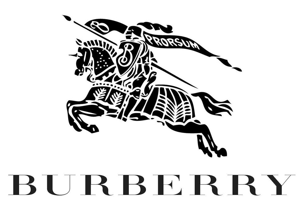
The very first logo for the fashion label was created in 1901 and featured a red emblem with a wordmark under it. The emblem took the biggest part of the logo and depicted an equestrian with a pike and shield.
The pike had a weaving flag on it, with the lettering “Prorsum” and an ornate letter “B”, which was also drawn on the shield.
As for the wordmark, it was executed in all capitals in a bold serif typeface, looking solid and powerful.
1968 – 1999
![]()
In 1968 the wordmark becomes a star of the logo. The emblem is now smaller and abstracts, only a black solid silhouette, without any details and letters. The lettering is now in title case and has a delicate “Of London” tagline in all-caps, written in the same serif typeface as the main inscription.
The logo looks ls now more like a fashion brand visual identity, reflecting style and elegance and representing an influential company with values of history and legacy.
1999 – 2018
![]()
The redesign in 1999 balances the logo, enlarging the emblem and making the wordmark a little smaller. The rider gets back his white contours, and the inscription is now in all capitals of an elegant serif typeface, which is very similar to Bodoni Family fonts, with sleek sophisticated lines and thin serifs.
The “Of” part is removed from the tagline, now it’s only “London” in capital letters, executed in the same font as the main wordmark, but in a smaller size and thinner lines.
The logo is harmonized and looks professional and classy, representing the best of the famous brand and accenting its expertise in fashion and design, along with a huge experience.
2018 – 2023
![]()
The current Burberry visual identity was created in 2018 and is a reflection of the new era for the brand. It represents a modern and young approach to design, emphasizing the progressive and energetic character of the label and its willingness not only to follow the current new trends but also to create them.
The wordmark is usually used on its own but sometimes is accompanied by a “London England” tagline, which is also written in capitals.
The knight is removed from the official logo, however, it still appears on tags and packaging of the brand, as well as on the patterns of the branded clothing and accessories.
2023 – Today
![]()
The redesign of 2023 has dramatically changed the style of the Burberry logo, adopting a new typeface, which is completely different in style and mood from the previous one. The refined uppercase inscription is set in a fancy and elegant font with shots and playful serifs on the end of slightly flared bold bars. The lettering is still set in plain black, but with the redesign it started looking more feminine and lively, as if the characters are going to start dancing above the line. The new font also looks a bit nostalgic, and looks like something in the middle between Moonllys Regular, and Valeson Condensed Regular.
Symbol
![]()
The equestrian carries a shield, which is to symbolize knightly purity, honor, pride, grace, nobleness, determination, and protection. The logo is performed in black to express the quality, elegance, power, and durability.
Font
The new Burberry wordmark in all capitals is executed in a modern sans-serif typeface, which is very similar to Urania Extra Bold font, designed by Dieter Hofrichter. It is a stylish interpretation of the old school sans-serifs, with thick neat lines and distinct cuts and angles.
What does the Burberry logo mean?
The logo of the iconic British fashion house Burberry is simple yet elegant and timeless. Today it is a stable heavy sans-serif logotype in the uppercase, but the brand is still associated with its historical badge; which was removed from Burberry’s visual identity concept only in 2018. It was a monochrome drawing of a knight on a horse, with a shield and spear, decorated by a long waving banner. It was a graphical representation of the nobility, pride, and sophistication of the fashion house.
What happened to the Burberry logo?
The iconic knight on a horse has been a part of Burberry’s visual identity for decades, since the infection of the brand, however, the redesign of 2018, has removed the emblem from the badge, keeping only a clean bold uppercase lettering in a modern geometric sans-serif font. This was made to reflect the progressive approach of the company and its ability to change according to the latest trends in the design world.
Why is Burberry’s logo TB?
The TB monogram on the historical badge of the Burberry fashion house is a tribute to the brand’s history and background. The letters — are the initials of the founder of the iconic brand, Thomas Burberry. The TB lettering could be seen on the emblems of the label since the beginning of the 20s century.


