Bank of America is among top financial corporations in the USA. It was founded in 1904 by Amadeo Giannini, and its first name was “the Bank of Italy”. It changed name in 1930.
Meaning and history
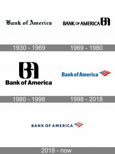
The Bank of America’s visual identity history can be divided into two eras — the first one, elegant and traditional, from 1969 to 1998, and the modern one, which is progressive and passionate, started in 1998 and continuing. Though for such a strong and reputable organization, Bank of America had been pretty constant with its emblems, as there were only two different concepts introduced throughout the years, and all the other changes were more refining.
What is Bank of America?
Bank of America is an American financial institution, which was established in the current state at the end of the 1990s, but has its roots dating back to the end of the 18th century. Today it is the second-largest bank in the United States, which provides a full range of financial services.
1930 – 1969
For 40 years, from 1930 to 1969, a leading American bank boasted a logo that commanded attention. Crafted in a bold, Gothic typeface, the inscription “Bank of America” conveyed a sense of gravitas. This font choice, distinct from the more common Roman script, imbued the logo with an air of weight, seriousness, and unwavering stability.
1969 – 1980
The Bank of America logo, introduced in 1969, boasted a monochrome inscription with an extremely elegant and sleek emblem, placed on its right. The lettering in all capitals was executed in a custom typeface with the ends of the clean and straight letter lines extending. The emblem was a stylized monogram “BA”, with both letters merged in one smooth symbol with thick rounded lines and shortened horizontal bars.
1980 – 1998
The redesign of 1980 made the emblem a central element of the logo, enlarging it and placing above the wordmark. The lettering of this version was executed in a title case of a bold and simple Helvetica typeface, evoking a sense of responsibility and confidence. The contours of the emblems were cleaned and refined, and now it did look chic and remarkable.
1998 – 2018
The new concept and bright color cake to the Bank of America logo in 1998. An intense blue wordmark in a slightly narrowed yet bold sans-serif typeface was placed in one line on the left from the stylish red and blue emblem. The emblem was a smooth rhombus composed of six rectangles, where two of them (on the left) are blue, and the others are red. The rectangles are separated by thin white lines. Resembling the American flag, the emblem of the bank also looks like a blanket, which gives a sense of protection, safety, and warmth to its customers.
2018 – Today
The redesign of 2018 refined the contours of the emblem, making the white lines thicker. The blue of the Bank of America’s visual identity was switched to a darker one, and now the resemblance with the national flag of the USA is even stronger. As for the wordmark, it was also redrawn, and today the logotype in all capitals featured a simple and clean sans-serif typeface with a lot of space between the letters.
Symbol
The current Bank of America Logo has been in use since 2001. It was accepted after the bank’s reorganization. The logo depicts the bank’s name written in blue and features a pattern of blue and red stripes on the right. The choice of colors was to emphasize the bank’s significance for the nation, as it clearly hints at the color palette used in the USA national flag. There is an opinion that the logo works well because it meets the patriotic feelings of Americans. This has to be the main reason why the bank has reached so big a success both in the USA and abroad.
Font and color
The bold and clean uppercase lettering from the primary badge of Bank of America is set in a heavy and stable sans-serif typeface, which evokes a sense of confidence and professionalism. The closest fonts to the one, used in this insignia, are, probably, Camphor Pro Heavy, Rig Shaded Bold Face, or Elisar DT Bold, with just some minor modifications.
As for the color palette of the Bank of America visual identity, it is expectedly based on the classic blue-red-white tricolor from the National Flag of the United States. Apart from their official heraldic meanings, these three colors make up a powerful combination, which evokes a sense of excellence and expertise, attention to detail, and security.
Why did Bank of America change its logo?
Bank of America changed its logo to show its progressiveness and ability to be in line with all the latest trends in visual identity design and marketing. The new logo of the bank represents its patriotism and power, with the clean contours of its bold letters standing for confidence and reliability.
Does Bank of America have a new logo?
The last redesign of the Bank of America visual identity was held in 2019, with the new logo created for the organization. The current badge is based on the previous version, but with all elements strengthened and emboldened. The badge of the Bank of America looks very modern and stylish, evoking a sense of excellence and professionalism.


