

![]() Axa Logo PNG
Axa Logo PNG
Initially, the French, and now the international insurance and investment group of companies AXA Group is well known throughout Europe. Their logo is adorned with both specialized forums and sponsorship events – social, cultural, sports.
Meaning and history
![]()
The visual identity of the AXA company is a representation of stability and fundamental approach, as once created in 1985, the elegant and recognizable badge wasn’t changed much, just the colors got switched to make them look more modern and bright.
1978 – 1985
![]()
The very first logo for the AXA company was created in 1978 when the name of the insurance agent was Mutuelles Unies. It was a horizontally-oriented rectangular banner in a deep shade of forest green, with the two-leveled white lettering in the lowercase, executed in a fancy sans-serif typeface with elegant contours of the characters, written in the left part, and the geometric emblem placed on its right. The emblem of the brand featured a stylized white element with two wings, drawn against a green background and enclosed into a medium-thick white square frame.
1985 – 1994
![]()
The AXA logo, introduced in 1985, featured an elegant monochrome inscription in a custom italicized typeface with the edges of the letters slightly expanding, resembling serifs. All three symbols of the wordmark had their bottom parts overlapping and intertwined, which added a sense of togetherness, unity, and reliability. This balance of the airy and light upper part and a pretty intense bottom one made the logo unique and timeless.
1994 – Today
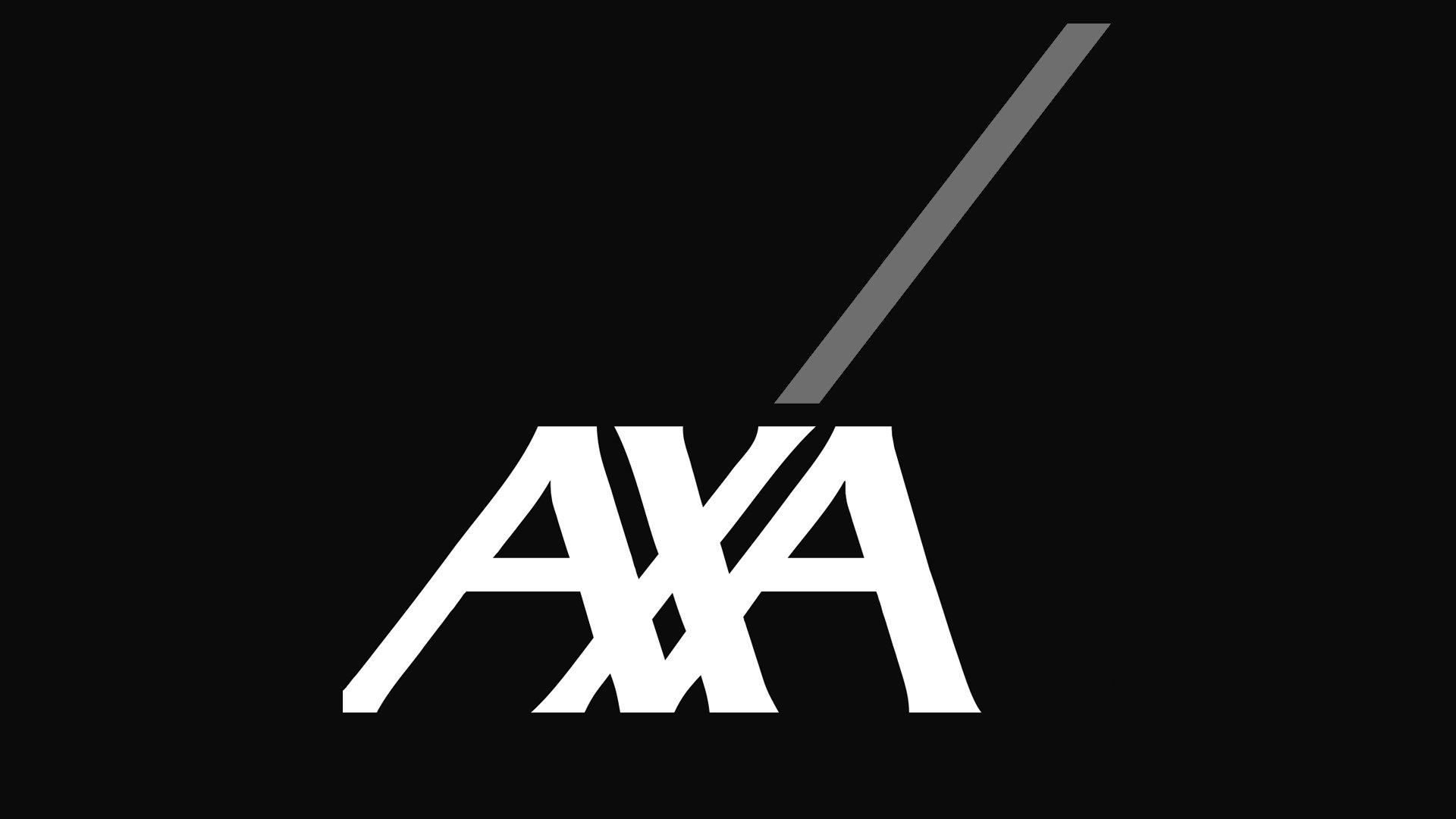
![]()
The redesign of 1994 brought a new color palette to the AXA visual identity, and this is how the logo we all can see today looks like: a white logotype, which completely repeats the previous version, created in 1985, is placed on the bottom left part of a solid blue square, and has a red thin diagonal line coming out of its “X” and going upright, as a symbol of growth, success, and progress.
The new blue, white and red color palette of the company’s logo is not only a tribute to its motherland, France, and the colors of its national flag but also a brilliant representation of the company’s values: responsibility, expertise, high quality of services and attention to the customers.
Symbol

The symbol AXA is a network of interaction, partnership and effective fulfillment of tasks. Interlacing of letters in the logo on a contrasting background allows, according to the principle of genius of the Renaissance, Michelangelo – to discard all unnecessary, creating true masterpieces. The red diagonal strengthens the dynamics of the graphic design, gives it a strong and impetuous character.
Emblem
Unlike many well-known brands, AXA Group refused to use a rigid framework for their logo. Depending on the task, boundaries can change, as well as the size of the logo. So, with the vertical placement of the emblem, the red diagonal element can be reinforced, while horizontal – the emphasis is on the font-color weave.
Color/background
![]()
The background color of the AXA logo is blue. And on a contrasting background the white font allowed to create a bright and memorable composition. In addition, the dynamics of the construction gives a red font at the top of the logo. These are innovations, aspiration for partnership and success.


