

![]() American Airlines Logo PNG
American Airlines Logo PNG
American Airliners, Inc. was founded in 1930, and then it was branded American Airways. Headquartered in Fort Wort, Texas, it has more than 600 airplanes and flies to about 50 countries.
Meaning and history
![]()
One of the most influential and famous air-carriers in the USA, American Airlines, was established in 1930 and the design of its visual identity was introduced only in 1934. The first name of the company was American Airways, but there was no need for changing the visual identity, as for the first three decades there was only an “AA” monogram placed on the carrier’s emblem, not the whole nameplate.
What is American Airlines?
American Airlines is the name of one of the leading air carriers in the United States, which was established in 1926. The company is based in Dallas, Texas, and has a fleet of almost 900 planes, which fly to more than 300 destinations worldwide.
1934 – 1945
![]()
The original logo for American Airlines was created by Goodrich Murphy and comprised a white eagle, with its wings spread upwards. The bird was placed inside the solid blue circle and had two bold red letters “A” on both sides. The eagle was standing on the globe, showing endless possibilities and power of the company. There was also a wide diagonal line in red, placed behind the eagle.
The blue, white, and red color palette of the airline’s visual identity is not only a tribute to the USA but also a very strong combination, perfectly reflecting influence, professionalism, and authority of the company.
1945 – 1962
![]()
The redesign of 1945 kept the eagle as the main symbol of the air carrier but changed the style and the color palette of the visual identity. The eagle in blue was now facing right and placed between two blue letters “A”, on a tender background with a clouds pattern. It was more minimalist and stylish than the previous version, yet less bright and eye-catching.
1962 – 1967
![]()
In 1962 the company comes back to its original blue white and red color palette, making the logo stronger and sharper. The deep-blue eagle with the monogram was now placed above the “American” wordmark, which was italicized and written in all capitals, using the same shade of blue as the image. The whole composition was enclosed in a thick red circle and placed on the light blue and white clouds background. This logo was a combination of two previous versions, the essence of their best features.
1967 – 2013
![]()
The completely new style and character were brought to the visual identity of American Airlines by Massimo Vignelli in the 1960s. The wordmark was now the main hero of the logo. Executed in red and blue, it was written in a bold traditional sans-serif without any space between two parts of the company’s name. The emblem was placed above the inscription and was also completely different from the previous versions.
The new minimalist emblem features two enlarged letters “A”, which were now drawn in different colors — the left one was in red, while the right one was colored blue. The stylized geometric image of the eagle was located between two letters and drawn in blue. The straight neat lines of the eagle reflected the progressiveness and power of the company, along with its willingness to move forward and its courage.
This logo stayed with the company for more than 40 years and became instantly recognizable across the globe as the graphical representation of one of the largest airlines in the world.
2013 – Today
![]()
In 2013 the logo was redesigned again. Now it is composed of a delicate and elegant sans-serif wordmark, written in dark blue, and an emblem, placed on its right. The emblem, known as the “Flight Symbol”, features an abstract tricolor image, where the stylized eagle’s head in white is placed on a blue and red background, composed of a thick diagonal line.
Symbol
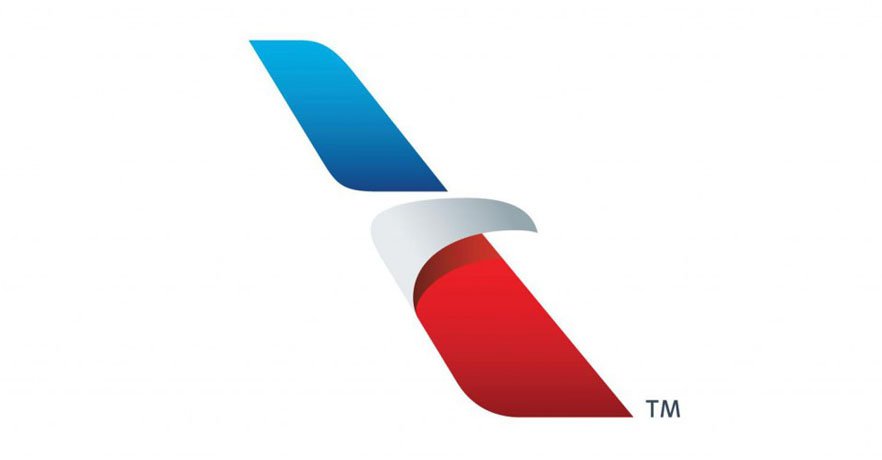
The company’s current logo depicts an eagle’s head; one of its wings is red, and the other one is blue. The logo reflects freedom and striving for success.
Shape and colors
![]()
After numerous transformations, the company chose a simple logo design. The white head of an eagle hints at the national symbol. The red color reflects energy and passion; blue stands for excellence, a sense of duty, and trustworthiness.
What is the logo for American Airlines?
The official logo of the American Airlines company is composed of a clean and simple title case lettering in a geometric sans-serif with medium-weight characters, followed by a stylized tricolor badge, depicting the symbol of the United States, a bold eagle, with its wings drawn as the plane ones. The logo of the air carrier is known as the “Flight Symbol”.
Where was American Airlines founded?
The American Airlines company was established in 1930 by several independent companies from different areas of the United States. Today the airline is headquartered in Fort Wort, Texas.
Who Created the American Airlines logo?
The current logo for the American Airlines air carrier was designed in 2013 by the famous marketing agency FutureBrand. The company managed to create a stylish and memorable symbol, a hybrid of an eagle and a plane, which has become iconic, and got a nickname the “Flight Symbol”.
Did American Airlines change its logo?
The badge of one of the largest airlines in the United States, American Airlines, was changed four times throughout the years, with the very first badge introduced in 1934, four years after the foundation of the company, and the latest version of the badge introduced in 2013.


