

![]() Alfa Romeo Logo PNG
Alfa Romeo Logo PNG
Alfa Romeo logo is relatively new – the current version was created in 1910. However, its content is multifaceted and therefore of interest to designers. And rightly so, there are the coat of arms of the XIV – XV century, the symbols of Milan, at the heart of the logo.
The Alfa Romeo logo is elegant and stylish. Upon a closer view, heraldically significant and ancient elements are found. In other words, there is a deep historical content in the modern form.
Meaning and history
![]()
The iconic Italian car marque was founded under the name Alfa Milano, with ALFA not as the first letter of the Greek alphabet, but as an abbreviation for “Anónima Lombarda Fabbrica Automobili”, and Milano — to celebrate the city it was born it. The second part of the name was changed to Romeo in 1915 after the company was bought by Nicola Romeo.
Despite the change of the name at the very beginning of the brand’s history, it has kept its original logo, designed in 1910 and this ornate and colorful badge is one of the most recognizable car emblems today.
1870 – 1910
![]()
1910 – 1915
![]()
The original Alfa Romeo logo was designed by Romano Cattaneo, who adopted two heraldic symbols in one badge. The logo was composed of a boldly outlined circle, vertically divided into two parts — the left one in white with a Red Cross on it, and the right one, where the green snake was placed on a light blue background.
The circular framing of the logo featured a dark blue color and the lettering, placed around its perimeter, was executed in light silver, with vignettes in the same color, separating two parts of the wordmark.
1912
![]()
The Red Cross in the logo is a tribute to Milanese warriors and a commonly used symbol of Christianity. As for the right part of the badge, it is much more interesting.
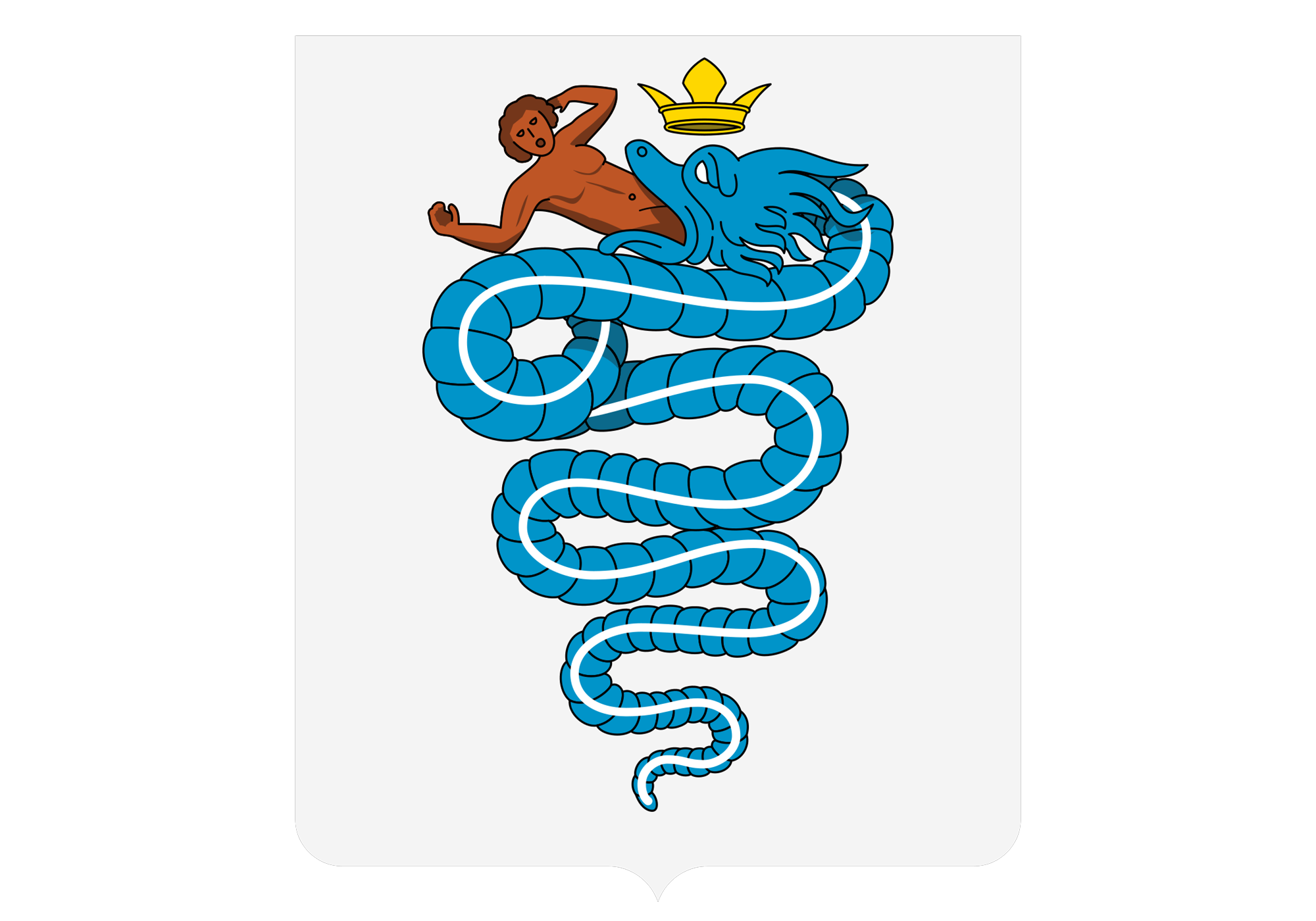
The red figure in the mouth of the Alfa Romeo Snake is not a flame or tongue, but a human. The symbol was adopted from the historic crest of the Visconti family, and it stands for power and influence. The serpent has become a symbol of the city of Milan, and for the name Biscione.
1915 – 1925
![]()
The logo was redesigned in 1915, after the brand’s rename. The colors of the badge were refined and elevated and the wordmark — elongated. Now the white bold “Alfa-Romeo” lettering in a gold outline was placed along the upper part of the circular frame, while the “Milano” inscription — at the bottom part. The contours of the cross and serpent were cleaned and made more confident and modern. Both blue shades on the badge became sleeker and more intense, and the man in the snake’s mouth became more visible.
1925 – 1933
![]()
The redesign of 1925 brought a second outline to the badge — now the silver leaf-wreath was placed around the wide blue framing with the wordmark. The colors were softened and lightened, and the inscription gained a new, more delicate, and professional typeface, which looked confident and bright in white color.
1933 – 1946
![]()
The wreath becomes gold in 1933 and the lettering and cross become enlarged. The logo now is eye-catching and powerful due to a strong color contract and massive design elements.
1946 – 1947
![]()
The brand’s logo gets a bit simplified in 1946, the wreath is replaced by a medium-thick silver circle, and the vignettes on the frame are now less curly and more delicate. All contours of all the elements have been refined, and now the badge looks stricter and more modern.
1947 – 1948
![]()
The iconic badge was drawn in a completely new color palette in 1947. The red and yellow combination, where all the yellow details and elements were placed on a solid red circle in a thin gold frame, stayed with the marque for only one year. The most significant change except for the color palette in this logo was the absence of the “-“ between “Alfa” and “Romeo”.
1948 – 1950
![]()
In 1948 the company comes back to its original concept and color palette, but two parts of the wordmark are now placed with a space between each other. The green serpent gained a thick black outline and the man in its mouth is colored red. The cross is also outlined, which adds balance to the image.
The white lettering around an electric-blue frame was executed in a clean and neat sans-serif typeface.
1950 – 1971
![]()
The snake becomes rounder and bigger and the man gains a geometric silhouette in 1950. The “Alfa Romeo” part of the wordmark is now enlarged and takes the most part of the frame, while “Milano” is written in a delicate lightweight font.
1971 – 1972
![]()
The “Milano” inscription was completely removed from the badge in 1971. The outline of two segments of the circle and its main elements was changed from black to gold and was balanced by a thin yet distinct gold outline of the emblem.
1972 – 2000
![]()
The Alfa Romeo logo gets refined again in 1972. The blue becomes darker, and it works brilliantly in contrast with the new shade of yellow, the outline and inscription are executed in. The contours of the cross and viper are also yellow now, as well as the red man’s contour.
The wordmark uses a bold and simple geometric sans-serif, which adds a sense of progress, style, and professionalism.
2000 – 2015
![]()
Some gradient shades were added to the logo in 2000 in order to make it more dynamic and vivid. The background of the cross segment is now light blue and white, while the lettering around the blue frame features colors from silver to gold. The badge looks fancy and fresh.
2015 – Today
![]()
In 2015 all the gold details of the badge are replaced by the silver ones. Another big change was done to the inner circle of the emblem — it is not vertically divided into two parts anymore, but featured a common silver background where the red Ross and the green serpent are placed touching each other.
Symbol
The basis of the logo symbolism is the use of symbolic images associated with Italy in General and Milan in particular.
As for the image of the red cross on a white background, it is the flag of Milan. It refers us to medieval history, the first Crusades, era of knights. Initially, the contrast of red and white symbolized Christ’s atoning sacrifice and its dual nature. Today it is a recognizable symbol of the Milan city.
Emblem
The form of the logo of the brand is the correct circle. The outline of this circle is highlighted in color and contains the name of the brand, Alfa Romeo. Initially, there was no inscription, it appeared later, as well as a wide outline, which became as the basis for the text.
For some time the emblem was surrounded by a laurel wreath – a symbol of the winners. Laurel leaves have appeared on the emblem as a sign of victories in car races.
The inner part of the emblem is divided into two parts that are up to heraldic requirements – in fact, these parts occupy two heraldic elements.
Despite the constant changes in the logo (the last time the logo was changed in 2015), it can be reliably stated that the century-old overall appearance is preserved. Correction of colors and simplification of forms emphasize respect of the brand to heritage and traditions of Milan.
Font
An easy-to-read font of gold color was chosen for the logo. Gold as a symbol of well–being emphasizes the specificity of the target group of the brand – adults, successful people with above-average income. The font has a classic shape, clarity and sufficient thickness for easy perception.
During the twentieth century, the font has changed many times. However, the changes were more of a decorative nature: the font was originally planned as easy-to-read, “confident” and “reliable”.
![]()
Color
![]()
The color scheme also attracts attention in the Alfa Romeo logo. The base color is dark blue and it occupies the largest area. The symbolism of this color in heraldry is significant – dark blue (blue) background is rarely used, and means the highest aristocracy, Royal blood, as well as a special favor of the Blessed Virgin. By the way, originally, the Royal snake in the right part of the logo was not green, but dark blue and swallowable baby was not red, but gold.
In the latest version of the logo, the blue snake turned green, gold is remained in the contours and text, and the image of the sacrificial baby turned red. Moreover, the color scheme of the logo is already interpreted very freely, without reference to the heraldic symbolism. Other factors, such as the composition and color balance between the two parts of the logo, have more importance nowadays.
Which creature is featured on the Alfa Romeo car logo?
The iconic Alfa Romeo logo depicts a green serpent with a red man’s body in its mouth. The symbol was taken from the ancient crest of the Visconti family, which was one of the most influential families in Milan in the XXI century.
What does the emblem on the Alfa Romeo mean?
The iconic heraldic Alfa Romeo logo depicts the Red Cross from the coat of arms of Milan and a crowned snake devouring a man. It is based on the legend that one of the founders of the Lombard family Visconti of Milan kills a Saracen who had a man-eating serpent on his shield.
What does the Alfa Romeo logo symbolize?
The Alfa Romeo emblem is considered one of the best automobile logos in the history of graphic design, despite the fact that the symbol has undergone numerous changes over the years. Its earliest version was introduced in 1910. It is believed that the emblem depicts the coat of arms of the Visconti family, which at the time was the most influential and respected family in Milan. The emblem also depicted a traditional red cross on a white background. The snake on the Alfa Romeo badge is a link to the legend of the ancient Italian legend about the dragon defeated by Uberto.
What does the clover symbol mean on Alfa Romeo?
The visual identity of the Italian automaker is composed not only of its iconic circular badge with heraldic elements but also of a stylized green clover, which can be seen on racing and tuned production models of Alfa Romeo.It first appeared in the 1920s on the racing Alfa Romeo of Italian pilot Ugo Sivocci. The racer has always been the second, but in 1923 he drew a clover on his car right before the race started and won it. Since then, the “Quadrofolio” (Italian for “Clover”) has become the symbol of the brand, bringing good luck.


