A small shop, created as a family business in the distant 1948, today has turned into a wide network, the supermarkets of which can be found almost throughout Europe.
Meaning and history
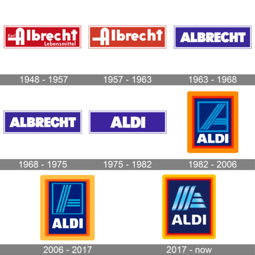
The visual identity of the European supermarket chain has changed three times throughout the company’s history, though the original color palette is still kept by the brand today, with just slight modifications. The Aldi logo looks laconic yet strong and bright, due to the right use of colors and an interesting geometry of the lines.
What is Aldi?
Aldi is a German chain of supermarkets, which was established at the beginning of the 20th century. Today the company has more than ten thousand stores all over Europe, offering the customers a variety of grocery products, beverages, and some houseware stuff. Aldi also has a line of goods under its own brand.
1948 – 1957
The rectangular emblem presents itself in a striking shade of crimson. The bold red backdrop captures attention instantly, making a powerful statement. At the forefront, the word “Albrecht” is spelled out in stark white, creating an arresting contrast against the red. The typography is simplistic yet modern, with each letter spaced to perfection. Above the brand name, the words “Karl” and “Lebensmittel” are delicately placed on opposite ends. The design, while minimalist in nature, exudes confidence and reliability. The use of a dominant color paired with uncomplicated typography evokes feelings of trust and steadfastness, characteristics often associated with long-established brands.
1957 – 1963
Dominating the canvas is a bold red rectangular framework, reminiscent of classic designs with a contemporary touch. Centered within this red box is the brand name “Albrecht”, displayed in an immaculate white. The typography here is both elegant and assertive, ensuring the name remains etched in the viewer’s mind. Each letter, from the sweeping curve of the “A” to the sturdy base of the “t”, is meticulously crafted, portraying a sense of precision. The design eschews any additional graphics or details, placing full emphasis on the brand’s name. This clear-cut approach is a testament to the brand’s confidence in its identity, and the minimalism exudes an aura of sophistication and class.
1963 – 1968
The ALBRECHT logo immediately commands attention with its bold typography and clean design. Set against a rectangular background, the name “ALBRECHT” is prominently displayed in capital letters. The choice of a white font against a rich, royal blue background creates a sharp contrast, making the name stand out and ensuring easy readability even from a distance. The rectangular design suggests stability and dependability, while the blue color evokes feelings of trust and reliability. This straightforward and no-nonsense approach to branding hints at a company that values clarity, directness, and perhaps has a longstanding tradition in its industry. The simplicity of the design allows it to be versatile, easily adaptable to various media platforms, whether it be digital, print, or physical signage.
1968 – 1975
In the this iteration of the ALBRECHT logo, we see the same striking design elements, yet with subtle variations. Once again, the powerful, all-caps typography of “ALBRECHT” dominates the visual field, creating a strong brand recognition. The deep purple hue chosen for the background brings forth connotations of luxury, sophistication, and prestige. The bold white letters stand in stark contrast to this regal backdrop, emphasizing clarity and precision. The rectangular border, slightly thinner in this version, encapsulates the name, symbolizing protection, consistency, and boundary-setting. This design speaks to a brand that prides itself on excellence, a rich legacy, and a commitment to maintaining its esteemed reputation in the marketplace. The minimalist approach ensures that the focus remains on the brand name, making it memorable and instantly recognizable.
1975 – 1982
The original Aldi logo was created in 1970 and featured a simple white logotype placed on a bright purple banner in a thin white outline. The lettering of the wordmark was executed in an extra-bold sans-serif typeface with thick lines and straight cuts of the letters. The contrast of white and purple made the modest logo look bright and memorable, showing the company as a strong and professional one.
1982 – 2006
With the redesign of 1982, Aldi got a graphical emblem, complementing its white logotype. The new composition featured a vertically oriented purple rectangle in thick orange and coral-red framing. The white wordmark was placed on the bottom of the emblem, under the light blue icon with the left part of the letter “A” executed in light blue lines.
2006 – 2017
In 2006 the contours of the Aldi emblem were refined, and the logotype got a new narrowed typeface, which looked modern and stylish. As for the graphical part, it still featured a part of the stylized letter “A” formed by three diagonal and three horizontal light blue lines. But with more space between them. The orange frame was replaced by a yellow one, which made the whole composition crispier and fresher.
2017 – Today
In 2017 the Aldi visual identity was redesigned again, redrawing the stripes “A” in smooth gradient ribbons. The lettering also changed its typeface to a sleeker and softer one, with rounded angles and edges. The color palette of the logo remained untouched, but due to the new style of the lines, the whole image started looking brighter and more intense.
Color and Background
The first logos of the network were a combination of red background (dynamics, head) and white font (restraint, nobility). Already in the 1960s, the main color was blue – and against its background, the white font remained. And only in the 1980s the creators of the logo found that it was not necessary to give up any of the colors. Then the logo acquired a vertical rectangular shape in a frame of several colors. Inside the frame, on a blue background, there is a white logo and a blue symbol – an element of the letter A, consisting of three blue stripes diagonally intersecting the field of the logo, and three similar bands located horizontally. Minor changes in the font, colors and thickness of the lines during the following years did not bring about any fundamental changes in the logo.


