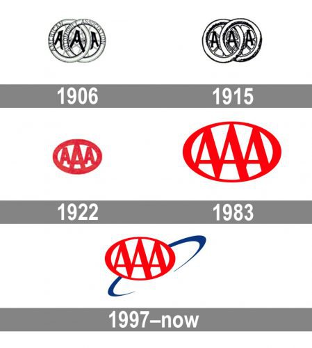
The logo of the American Automobile Association has been modified only about five times throughout its more than 110-year history. Over the years, it was becoming brighter and more compact.
Meaning and history
The American Automobile Association was established at the beginning of the previous century, but despite its long history, the AAA visual identity has been pretty constant and modest, with only four three major redesigns.
1906 – 1915
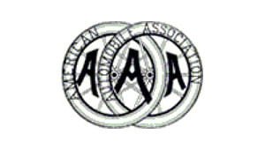
The original AAA logo was introduced in 1906 and boasted an elegant and delicate image, composed of two intertwined wheels with the “American Automobile Association” inscription around their perimeters, executed in a lightweight Sans-serif typeface and capitalized. Three fancy bold letters “AAA” were placed in three segments of the image, looking confident and slightly playful.
1915 – 1922
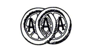
The emblem was first redesigned in 1915, keeping the consent unchanged. The contours of the wheels were refined and the lettering was removed from the circular perimeters, though the three “A”s remained, executed in a thinner and more sophisticated typeface than on the previous versions
1922 – 1983
The next version was the first one featuring color. Although the original shade of red was somewhat different from the current one, this version of the logo already had a lot of elements that make the current AAA logo recognizable. The automobile wheels were replaced by a single ellipse; the “A’s” grew simpler, bolder, and closer to each other. The letter in the middle was the biggest one, while the two other letters were smaller.
On the whole, the 1922 emblem lost much of the retro elegance of the original one, yet adopted a more monolithic and compact look. Also, it was by far more legible.
1983 – 1997
In 1983 the badge was redesigned again, keeping the composition of the previous version, but making it sleeker and sharper. The letters in the red and white medallion were redrawn, and now featured elongated lines and overlapping bars in the bottom part of the badge. The thickness of the framing was also a bit modernized and now the oval was thinner on its upper and bottom parts.
1997 – Today
In 1997 a delicate blue orbit was added to the modern and bright AAA badge. It was drawn diagonally and placed behind the emblem, on its right part. The new logo looks light and stylish, and its simplicity only elevates the logo and reflects professionalism and reliability.
Symbol
The original AAA logo, which was unveiled around 1906, contained two automobile wheels – an explicit indication of the field the association was working in. And of course, there were the three “A’s.” They looked elegant and were somehow reminiscent of the automobile style of the era. The full name of the organization could be seen written on the tires.
The following emblem (1915) featured two automobile wheels as well, but this time they had a slightly different style. The lines seemed bolder. The logo was black and white, like its predecessor.
Font
While the brand’s official type is Frutiger Bold Italic, it’s definitely not the font featured on the American Automobile Association logo. Here, the letters are rather traditional, while their lines have a varying width.
Colors
The vivid shade of red is Pantone 485 (Hex: #D81E05), while the shade of blue is Pantone 287 (Hex: #003893). In some situations (to refer to Three to Five Diamond facilities, for instance), metallic shades can be used: Silver (Pantone 877) and Metallic Gold (Pantone 873).


