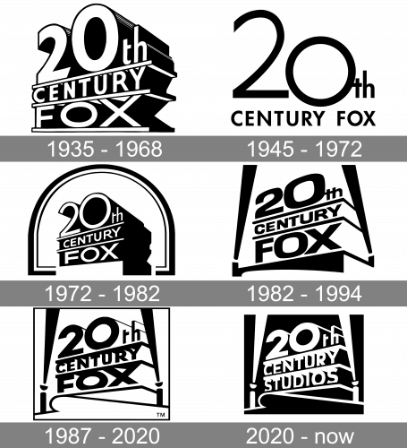
The history of the 20th Century Fox logo should be traced back to 1915 when the history of the company itself started.
Meaning and history
The visual identity of the 20th Century Fox company hasn’t changed much since the introduction of its original version in 1935. The iconic emblem, which is instantly recognized across the world, has only been slightly modernized and strengthened by today, without losing its individuality and style.
1935 – 1968
The original 20th Century Fox emblem was designed by Emil Kosa Jr in 1935. It was a three-level construction, divided by three bold horizontal parallel lines. The upper floor of the logo was taken by the enlarged “20th”, under it there was the “Century” in all capitals, and the bottom line was for “Fox”. The structure was placed in ¾ and featured all its white letters in a distinct black outline shadowed, which gave a three-dimensional image.
1945 – 1972
The company changed its iconic logo to a completely different badge in 1945, keeping the new style for 27 years. It was a flat monochrome emblem with the “20th” enlarged and placed above the “Century Fox” in all capitals of a modern and clean sans-serif typeface with bold lines and classic shapes.
1972 – 1982
The three-story structure comes back to the company’s visual identity in 1972, but this time it is enclosed in a double framing with its upper part arched. The letters of the main logo part were rewritten in a more contemporary sans-serif typeface, which made it look fresher and more stylish.
1982 – 1994
The famous Landor Associates design bureau redesigned the iconic logo in 1982, placing it on a black background with two white search-lights on the sides. This version became the basis for the following redesigns of the company’s visual identity.
1987 – 2020
The typeface of the inscription was changed in 1987. The letters became bolder and stronger and their contouring — more visible. The shadows and volume were back to the emblem, which made the whole image more powerful and eye-catching. This design stayed with the company for more than thirty years.
2020 – Today
The company was renamed to 20th Century Studios in 2020, which was followed by the redesign of the iconic logo. The new image, created by Picturemill, is fully based on the previous versions but has its bottom line replaced by the new lettering. The lines of the letters were cleaned and modernized, giving a more progressive and contemporary look to the whole badge.
Colors
Although there has been some playing around with the shades, the 20th Century Fox logo has remained consistent in its golden palette enriched by the colors of the sky.
Does 20th Century Fox still exist?
20th Century Fox does not exist anymore. The company, which was established in 1935, has restructured in 2020, becoming 20th Century Studio. That happened three years after the acquisition of the brand by The Walt Disney Company in 2017.
How old is the 20th Century Fox logo?
The first version of the iconic 20th Century Fox logo was created in 1935 by Emil Kosa Jr. Since the introduction of the original version, the logo has been redesigned four times, with the original composition kept almost unchanged, but the contours of the characters refined and modernized.


